Visual Design System
IBM
A positive employee experience is what the CIO organization offers all IBMers, so an illustration style guide that reflects that while also depicting complex ideas was the ultimate goal.
Read about the full process on Medium
my role ↘ art direction, motion graphics, illustrations
↓ Video
As the technology industry evolves, so does the perception of illustration within it. More and more companies are seeing the value in creating a brand identity that’s not only memorable but also human. The style that sets the tone for your product or service can impact the consumers as well as the employees who create them. A positive employee experience is what the CIO organization offers all IBMers, so an illustration style guide that reflects that while also depicting complex ideas was the ultimate goal.
A style for everyone
The creation of a design system that’s cohesive but also expands to a multitude of different projects was the challenge I faced when developing the illustration style guide. The guide would be constantly growing as it’s being implemented into our internal work and would need a strong foundation to support that growth.
In the beginning
The beginning phases of the character designs started with using more exaggerated proportions and simplistic features on faces. To be more inclusive, my initial thought was to create characters only in the colors provided by the IBM Design Language. But after some user testing and multiple iterations, natural skin tones and more realistic proportions to promote diversity and inclusion were the way to go.
The first iterations of the illustration style mainly came from experimentation on an ongoing project that I worked on where I was able to test out a multitude of styles and techniques that would later evolve into what we use today.
Creating Guidance
Guidance that felt both informative but also relaxed enough for creativity was an important balance. We wanted designers to feel empowered to make their own choices and make decisions that best fit the projects they were working on.
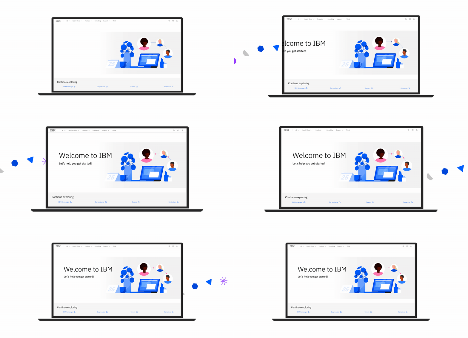
The classic style uses personalized and playful elements to create engaging scenes that draw the user in and create a memorable experience.
The lightweight style is a technology-based version of the classic style best suited for communicating concepts concisely.
Bringing IBM’ers together
One of the key challenges in developing this design style was effectively conveying information through various communication channels, such as email and Slack announcements. Given the wide range of messages and different stakeholders involved, my goal was to ensure that each event or announcement stood out while maintaining a cohesive visual identity. I was mindful of the need for flexibility within the design system, allowing for subtle variations in style to differentiate each message or event while still adhering to the overarching brand aesthetic.
To achieve this, I leveraged the versatility of the illustration style, which includes several subsets that can be adapted by different leaders, product owners, and designers. This flexibility empowers each team to create a unique yet consistent visual representation for their specific announcements, helping to tailor the design to the tone and context of the message, while preserving the integrity of the broader visual language. By incorporating these adaptable elements, I ensured that each communication was both distinct and aligned with the overall brand identity.
CIO characteristics
The CIO organization’s illustration style is both calm and confident, mixing soft shapes with fluid lines and hard angles. We incorporate playful, unexpected personal details into our work to make experiences relatable to IBMers. Our style is airy and focused, keeping IBMers engaged, productive, and at ease.
Our illustrations embody certain quality attributes to create experiences that are welcoming, calming, and inclusive. We take into consideration each designer’s unique perspective in design and created a system that has the creative freedom a designer craves with the cohesiveness a brand needs.


Objects and knick knacks
I developed a comprehensive design library hosted in Box and Lingo, which was later transitioned into an editable Figma library for ease of use and collaboration. This resource enabled designers to access and reference assets tailored to their project needs, ensuring consistency across visuals. Additionally, I encouraged designers to adapt the library’s style for their own projects and provided support by fulfilling requests for custom visuals as needed.
Integration with Carbon
Carbon is IBM’s open source design system for products and digital experiences. With the IBM Design Language as its foundation, the system consists of working code, design tools and resources, human interface guidelines, and a vibrant community of contributors.
The Lingo library
The Lingo library is a resource we created for our team of designers and non-designers alike that can be used as an internal inspiration website and a way to quickly implement pre-made illustrations into projects. The library is home to over 300 assets available to be downloaded as a .svg to be used in different programs such as Illustrator, Photoshop, and Figma.
I developed a collection of starter scenes for the Lingo and Box apps, providing IBM employees with ready-to-use resources or flexible starting points for their projects.
Visual Playground


