Site Rebrand Exploration
Templafy
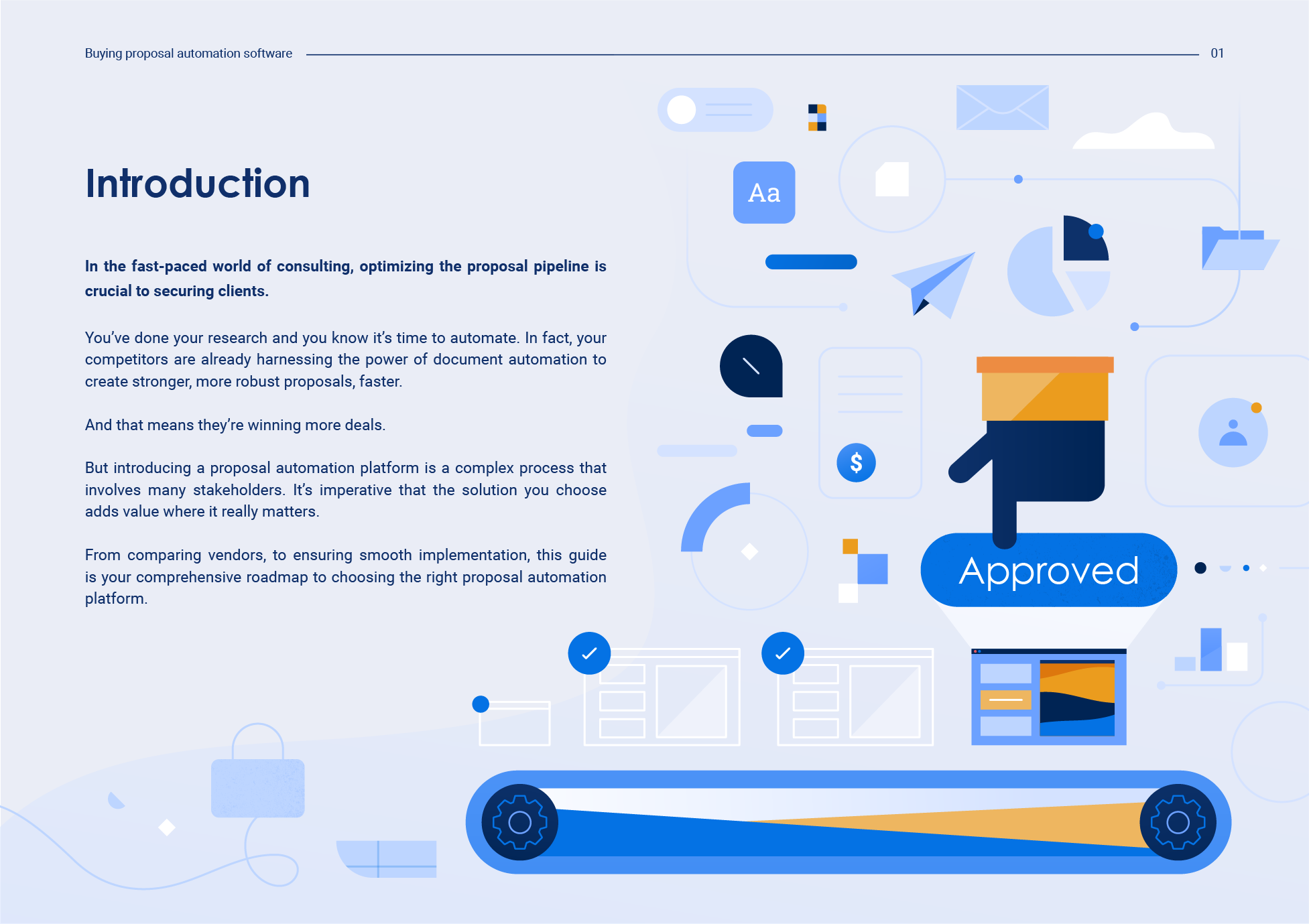
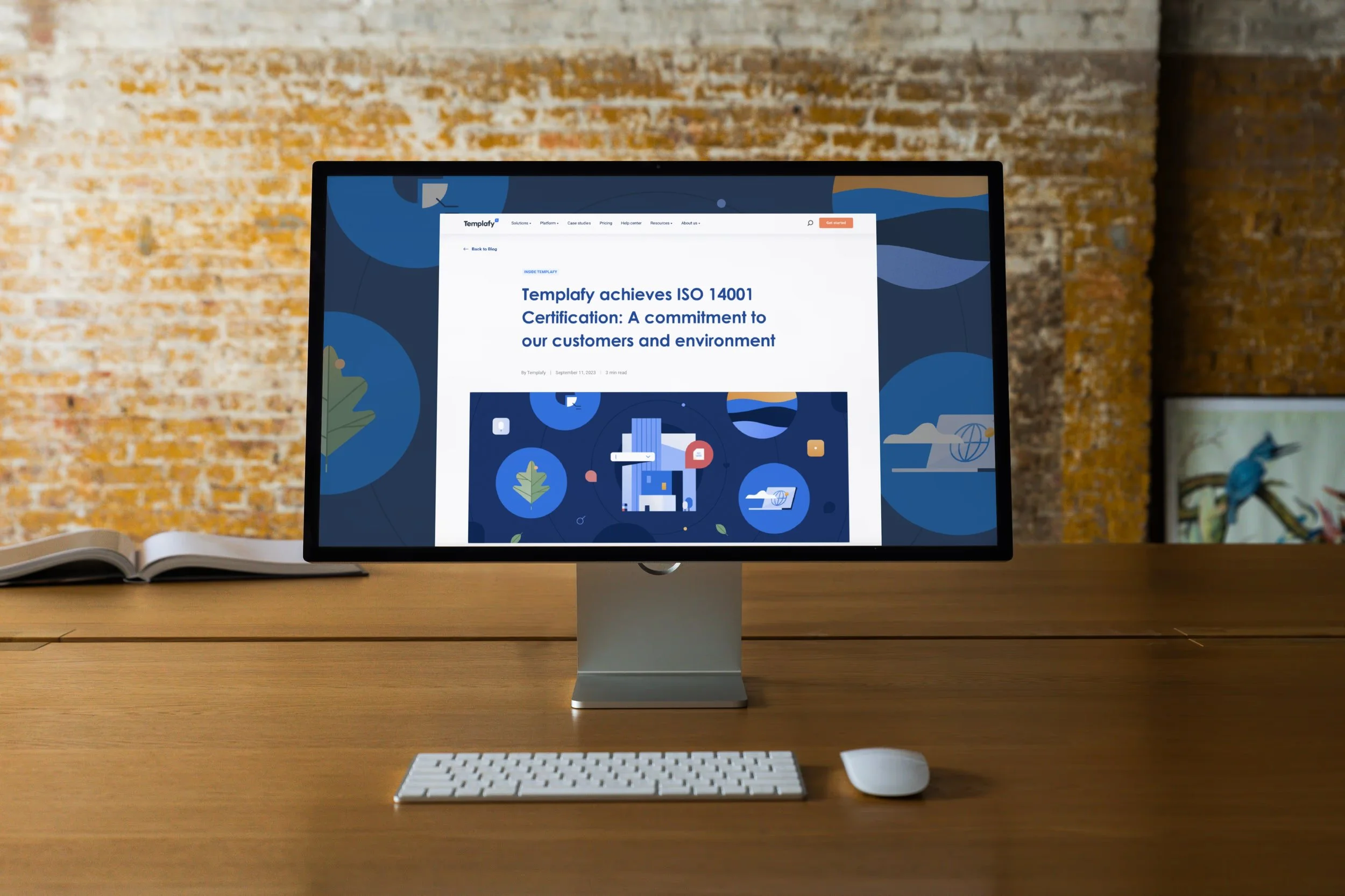
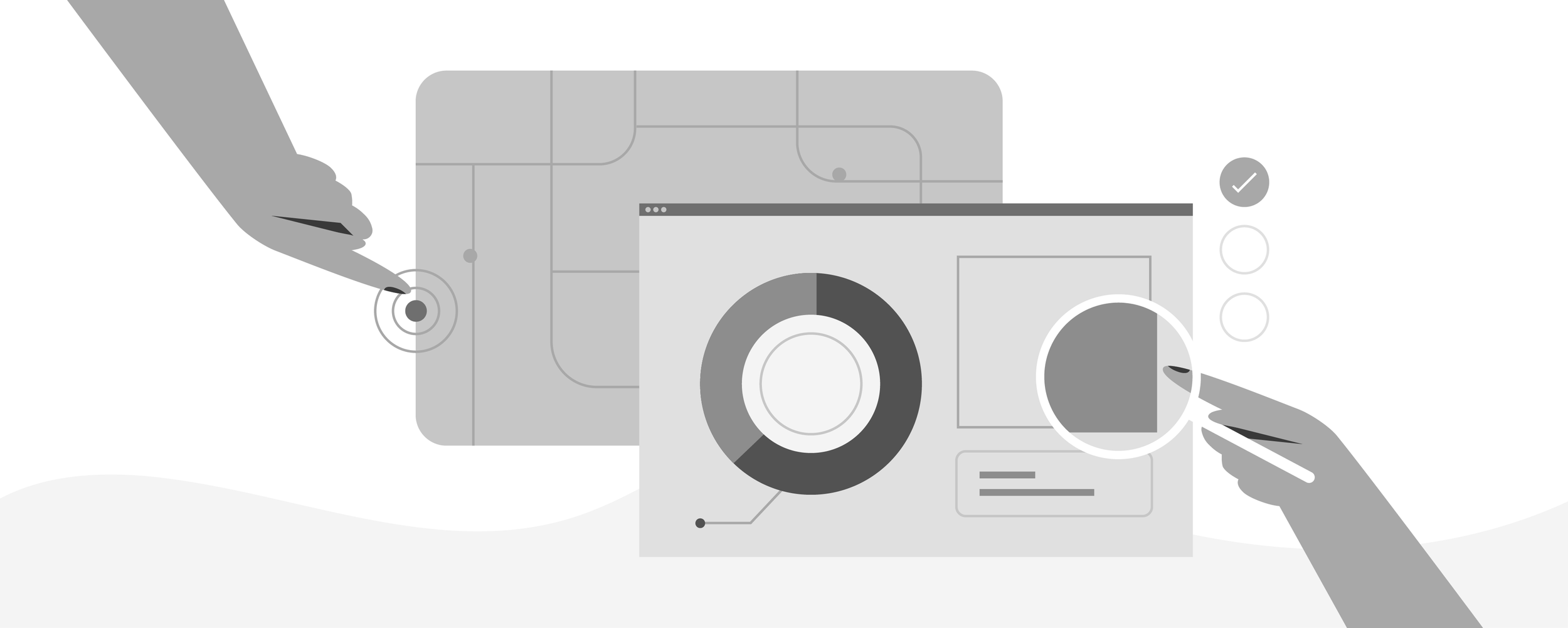
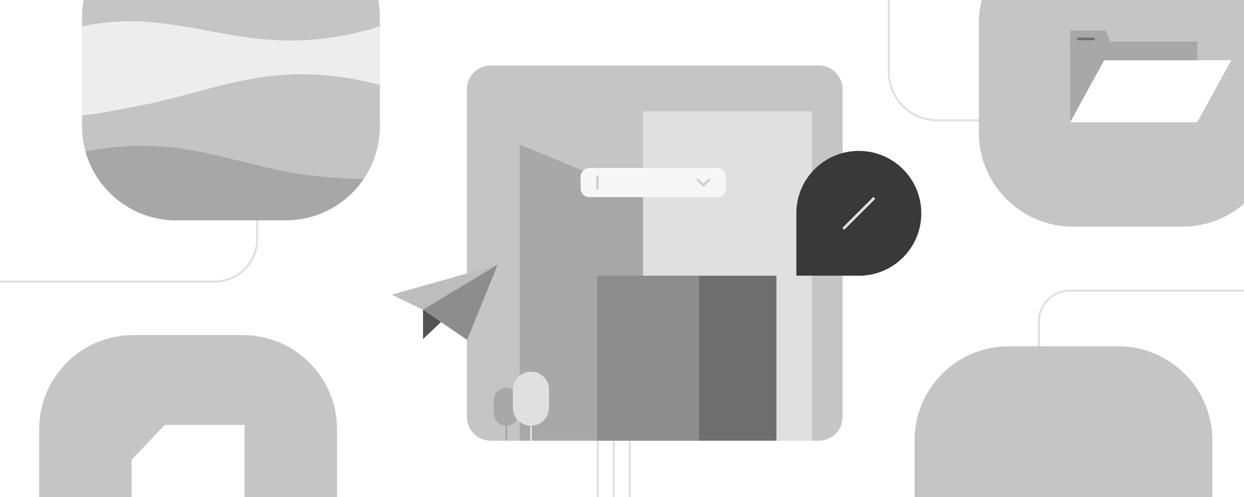
Templafy approached me to design custom blog headers and exploratory visuals as part of their website and graphics rebrand. I collaborated with their team to understand the evolving brand identity and created on-brand imagery that enhanced the user experience while aligning with their refreshed aesthetic. The final designs aimed to elevate Templafy’s online presence, fostering a cohesive and engaging visual narrative across their digital platforms.
my role ↘ illustrations, brand identity
Icon exploration
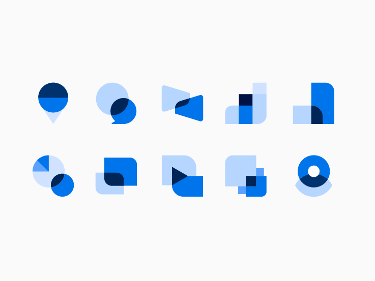
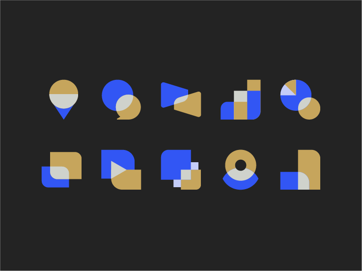
Working within the framework of Templafy’s established color palette and their request for a design utilizing simple, geometric shapes, I developed a highly cohesive and streamlined icon pack. The objective was to create icons that were both visually appealing and functional, adhering to a minimalist design approach while maintaining clarity and accessibility. The final set features a uniform and polished aesthetic, ensuring consistency across various applications.
Additionally, I designed three distinct color variations for each icon, offering flexibility for different contexts and use cases. This approach allows for easy customization and scalability, ensuring that the icon set can be expanded or adapted as needed in the future without compromising the overall design integrity. The result is a versatile, clean, and modern icon pack that seamlessly integrates with Templafy’s visual identity and can evolve as their design needs grow.
